Color Contrast
How to set up a sufficient contrast ratio
Accessibility
How to set up a sufficient contrast ratio
When the text on a page and its background have a very low contrast ratio (i.e. they almost blend in colour and brightness), it is difficult to read.
Reading speed and comprehension can be compromised, for example, when writing in a colour such as light grey on a white background.
In addition to creating difficulties for visually impaired users, this makes the experience of all users negative, even and especially if they are visiting the site in a place with lots of light (e.g. outdoors).For example, if you have ever read something on your mobile device outdoors, you have probably experienced the need for text with sufficient contrast.
How the SeoChecker color contrast audit is displayed
If the page's text and the background have a low contrast ratio, SeoChecker will notify it.
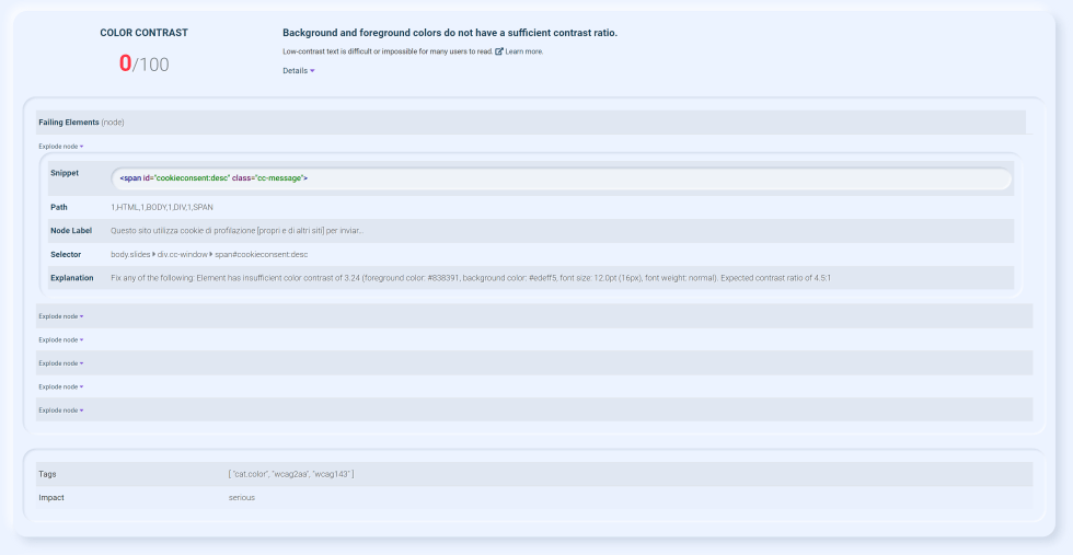
The criterion used by SeoChecker to perform the score is 1.4.3 from WCAG 2.1, that indicates these parameters:
- a contrast ratio of 3:1 is necessary with a 18pt or 14pt bold text.
- a contrast ratio of 4.5:1 is necessary for the other kinds of text.
How can I be sure that there is enough contrast ratio?
In order to set up a valid contrast ratio, we recommend you to use the SeoChecker's Color Contrast Checker tool.